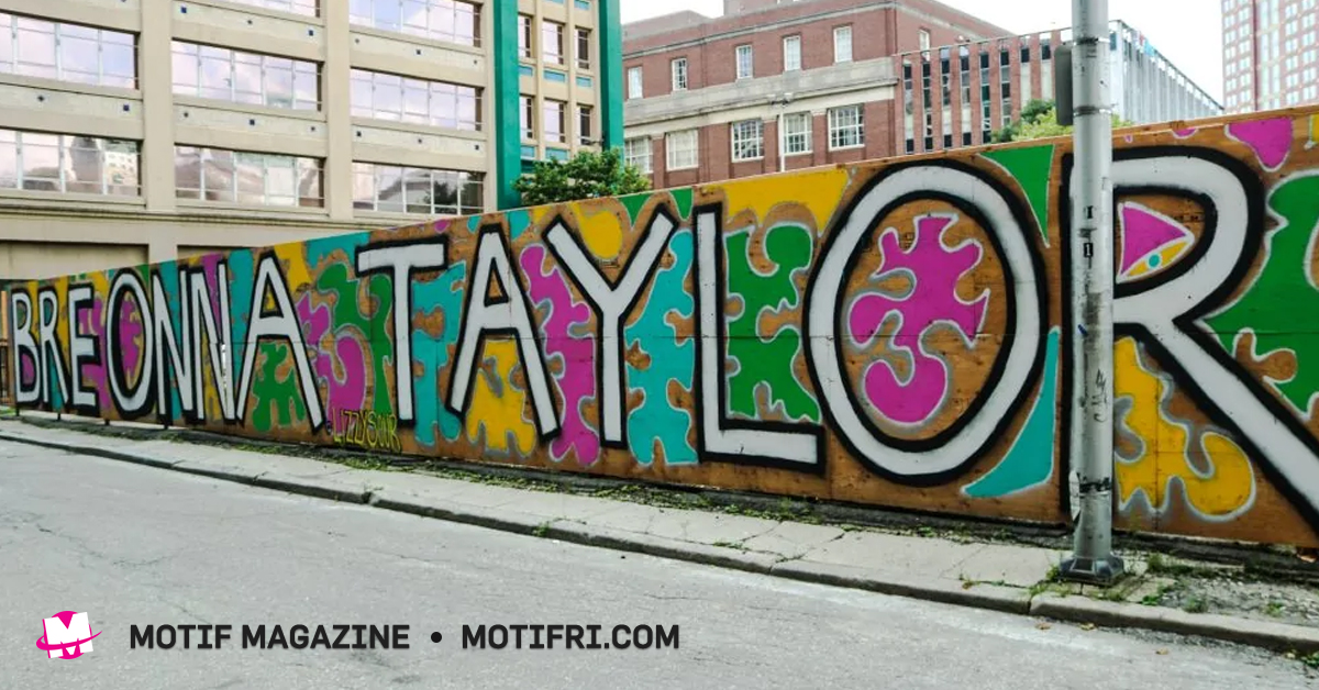
Artistic Expression: This pandemic is hitting artists where it hurts
|
Performance cancellations, while necessary, are having a very real impact on the income of local artists. On this page, we’ll compile a list of resources and fun stuff to help artists connect, support each other and express themselves. To add to this list, email news@motifri.com
Rad Cat Crimson Al-Khemia insists that “the quarantine can’t stop the scene” and encourages artists to keep expressing themselves by posting videos of their performances with #TheRadRemedy.
Head Trick Theatre will help you take part in #TheRadRemedy. Email your idea of a theater performance or scene you’d like to perform and record to headtricktheatre@gmail.com.
Spoken word artist Christopher Johnson also suggests artists post videos of their performances with #SocialDistance.
An Ode to the Analog: The Linotype Daily project is part diary, part news filter and completely perfect
|
I am at DWRI Letterpress, and I am standing in front of a Linotype, the first automatic typesetting machine — a machine that Edison called the “Eighth Wonder of The World” — and over the whirring, clanking and spitting of its 3,000 moving parts, Dan Wood is explaining why it’s so wondrous, or in his words, “Completely insane! This started a whole new printing revolution: the second printing revolution after Gutenberg. Up until the 1880s, everything had to be handset — this machine made school textbooks affordable, and suddenly instead of two- or three-page newspapers you could have daily newspapers that were 20 or 30 pages long. It launched us into the information age.” At the turn of the century, the Linotype was a marvel of modern engineering; it was, in Dan’s words, “breathtakingly fast…and now it’s like, so, so slow.”
Dan would know. He’s the artist behind The Linotype Daily, and for 366 consecutive days (ending on Leap Day), he produced a new “print, card, pencil or other Linotype-created work” using this fin de siècle marvel. Dan’s website describes The Linotype Daily as “part diary, part news filter.” He had a number of print subscribers, and a spot in the World’s Fair Gallery, but many encountered the project through the Instagram account @thelinotypedaily.
Dan’s daily posts toggled between the political (“PRESIDENT PARDONS WAR CRIMINAL,”) and the personal (“TEENAGE WHISTLEBLOWER ALLEGES HER DAD ATE THE PEANUT BUTTER”), the local (“PRONK!”) and the national (“HONG KONG, BEIRUT, SANTIAGO! MILLIONS CONTINUE PROTESTS”). The voice of The Linotype Daily is that of a hard-nosed reporter of bygone days: authoritative and bombastic (“When you put it in print, people can’t hear my ‘every-sentence-is-a-question’ inflection”). The fonts, classic early-to-mid-century newspaper typefaces, carry a similar power, as does the printed word itself (“People think: ‘they wouldn’t print it if it wasn’t true.”).
There’s a wry irony in the juxtaposition between that authority and the content of the posts themselves, which reflect the dizzying, haphazard tone of our hyperactive news cycle (“THE WORLD IS STILL A MESS”). “It’s been such a weird year,” Dan says. “Day after day it’s worse and worse and everything is just so bizarre.” That absurdity comes out in the Daily, sometimes as whimsy (a Democratic Debate scorecard modeled after an Olympic Figure Skating card), sometimes as despair (“I CAN’T KEEP UP!”), often as both.
Dan grabs a loose Daily from a nearby stack and passes it to me (“DEATH EATERS TRIUMPHANT! REPUBLICANS SILENT AS PURGES CONTINUE”). I run my fingers over the debossed letters as he muses: “I’m printing a hundred copies of this, but on the Instagram hundreds, thousands, whatever, all these people are going to see a digital replication of this handmade thing, but because it’s handmade, they’re going to spend more time looking at it than if it were just, like, a meme. Which is a weird thing. But people like things that are handmade. The amount of time it took for you to make it seeps into its meaning somehow.”
Part of what makes The Linotype Daily intriguing is the allure of the tangible. The studio itself is a sensory playground: the lead bubbling in the crucible of the Linotype (in which old type slugs are melted and reborn); the chunk-chunk of the Heidelberg spitting out copies (“I can’t watch anyone using this machine because it looks like you’re sticking your hand in it,” Dan says, as he seems to stick his hand in it); the paper invitations and cards and posters that line the walls (including all 366 Linotype Dailies).
The studio is a veritable museum of archaic machinery, and the project is, to some extent, an ode to the analog. Making a single Linotype Daily took Dan between one and five hours: writing the post, setting the type, loading and operating the machines, selecting the typeface. Dan points to a card that says “IMPEACHED” — “This 96 point Gothic is a really weird typeface, it’s got this playful joy, it’s really strange.”
That so many people encountered and engaged with this staunchly old-fashioned art on social media adds a layer of irony that Dan seems both bemused and fascinated by: “It’s very, very strange.”
“[These days] there’s so much information that we’re not even capable of sorting through it … with the project it was kind of like … maybe taking the time to do this little thing will be a way to sort of navigate the information overload that we’re all living in.” Social media gave him a chance to turn that sorting, the processing of a chaotic year, into a dialogue with his audience. “I feel like speaking honestly is the artist’s only job,” Dan says. “Just doing that is creating some meaning. If you’re doing something you feel genuine about, other people will appreciate that.”
If you’d like to see The Linotype Daily irl, it will be part of a show at Galerie le Domaine (145 Wayland Ave, PVD), called “Our Ephemeral World: from Plants to Paper to Print,” on the first Gallery Night of 2020, March 19 from 6 – 8pm. The posts are also available for purchase through dwriletterpress.net
Royally Creepy Creations: Local artist Jesse King’s art will fuel your nightmares
|
Jesse King
Jesse King is a self-taught artist living in Rhode Island who turns ordinary children’s toys into freakishly ghoulish monsters. One of King’s creations was recently seen at an event hosted by PVD Horror to benefit The Providence Animal Rescue League. The creepy, razor-toothed bear was extremely popular among the crowd and left attendees wondering where they could see more of King’s work. King answers this question and more below in her interview with Motif.
Amanda Grafe: How would you describe what you do?
Jesse King: I use my special effects artistry skills to transform ordinary toys into creepy creations. I have a growing inventory of unwanted dolls and stuffed animals that I acquire from thrift stores, friends and yard sales. There is an abundance of unwanted porcelain dolls and toys out there. I see this as a unique way to rescue these objects from ending up in the landfill by repurposing them.
Sleep well!
AG: Besides stuffed animals and dolls, what other materials do you use?
JK: I use a variety of materials, but what I consistently use are liquid latex, paint, stage blood and a glue gun.
AG: What is the process of creating like for you?
JK: I have a dedicated corner in my living room for my SFX art. It’s this awesome storage cube shelf that holds most of my supplies and it has an attached table. I take a “before” picture of the toy in its original form and think of how I could make it completely disturbing. Or I just start working on it and see where it takes me. I may start by melting and molding a bunch of sharp teeth from plastic or building many layers of liquid latex and tissue paper on the doll’s face depending on what look I’m going for. Or I might just do a three-step process that gives the dolls that old cracked look. I aim to make every creation one-of-a-kind. I am resourceful and have used body parts and pieces from other dolls or teddy bears. I once used a decapitated Barbie head to make a shrunken head look. Once I piece and mold everything together and blow dry what needs to be dried, I get to paint. The painting is my favorite part. I love mixing custom colors and blending them into my work. That’s when everything starts to come to life. I think finding a suitable outfit for a doll is the toughest part. Most of the time, I can just use the outfit they came with after I dye it a murky gray or brown color. Sometimes, they just don’t have a suitable outfit so I’ve been known to shop the thrift store in search for the perfect outfit in the baby clothes section. Once, I even debated bringing my creepy clown doll in with me to find an outfit that would fit him, but I didn’t want to draw attention to myself. When everything else is completed on my creation, stage blood and a clear coat sealer are the final touches. I list my creation online with its own name and short back story.
AG: What first inspired you to begin transforming children’s toys into scary creatures?
JK: I’ve loved horror movies and books since I was a little kid. I’m a fan of made-up horror, gore, monsters and anything strange. I’ve loved special effects makeup for a long time. I used to do SFX makeup on people for practice and for Halloween. I even volunteered my services for a low budget movie one time. It was a lot of fun, but what I loved more than anything was creating my own gory prosthetics. I was so happy and content working on a dangling eyeball or a set of exposed ribs for hours. Then I just stopped doing SFX for years because I wanted to go back to school and get a “grown up” job. Life just got really busy and I never had the down time to be creative. I always missed doing SFX makeup, but I didn’t see how it could provide a good return on the investment of my time. I actually stumbled on the idea of creepy dolls by accident. In addition to my full-time job, I was selling stuff on eBay on the side. I used to watch YouTube videos to learn what kinds of products were selling online. One day, I came across a YouTube video about “Creepy Dolls that sold on eBay” and I was intrigued. I did not know that people collected creepy dolls! I guess I never even thought about it. I’ve seen those “creepy dolls” at the stores around Halloween and I even own one but it never occurred to me that there are people who collect them year round! After this, I immediately started researching what kind of creepy dolls were selling and what people were looking for. I saw that people were transforming ordinary dolls into scary dolls and I knew right away, this was my niche! Soon after that, I was at a yard sale and this woman was selling a ton of dolls. I saw this as a sign and was so excited that I bought them all! I dug up my old special effects train case, ordered a new gallon of liquid latex and stage blood and I got to work! It was then that I discovered that I LOVE transforming dolls into my own works of horror art. It was the perfect kind of work for my introverted personality. Dolls don’t feel uncomfortable sitting for hours while I paint them. I don’t feel obligated to make casual conversation with them. Most importantly, I don’t feel like it is a liability to work on them. I don’t have to fear them having an allergic reaction to the materials and I can use a hot glue gun on their face and not worry about getting sued. When they are finished, I can spray them down with a clear coat of spray paint and not have to worry about them passing out … just kidding on the last parts. I’ve always been responsible with my art, but it is so refreshing to be able to practice my art in a less demanding, quiet environment that is comfortable for me.
AG: Do you create by yourself or are other people involved in what you do?
JK: All my creations are made solely by me. My dog, Hank, likes to claim he is supervising me, but he really is just napping on the couch nearby.
AG: Are there any people in particular who you have learned from or have inspired you who work in a similar genre of art?
JK: I’ve always been a big fan of YouTubers, Glam and Gore and Ellimacs. They are special effects makeup artists who create their own prosthetics and do mainly horror looks. I’ve learned some techniques from them. I also appreciate SFX makeup on films like “The Walking Dead” and ’80s horror movies like Nightmare on Elm Street, Poltergeist, Killer Klowns from Outer Space and I guess Puppet Master and Child’s Play are similar to my genre of art as well.
AG: What role does the horror genre play in your creative process?
JK: My creative process is primarily based on horror. I aim to create cringe-worthy art that reminds you of being a kid and imagining a monster lurking under your bed. Almost every creation looks better with some more blood.
AG: What is your favorite horror movie?
JK: I don’t have a particular favorite movie. I’m a big fan of monster, zombie, vampire and paranormal movies. It’s fascinating to me to see a creature that was once in someone’s imagination come to life in a movie or a work of art. My favorite generations of horror are the ’80s through ’90s. This is when, in my opinion, horror movies were actually scary. There were a ton of handmade special effects that were just creative, messy and scarier than a lot of cookie cutter scenes that are digitally done today. There was something disturbing about a real person actually being behind the monster on the screen.
AG: What are you trying to say with your work?
JK: There is nothing more powerful than the imagination. You’re never too old to play with toys.
AG: How is your work meant to contribute to the world of art?
JK: They are a fun escape for people who enjoy horror and appreciate the art of transforming an ordinary object into something dark and creepy. My creations are an awesome way for horror collectors to creep out their friends or trick or treaters on Halloween. I’d like it to be that I can contribute to keeping handmade horror art alive in a generation where everything is CGI or digitally done.
AG: Where can we find more of your work?
JK: Follow me on Facebook and Instagram @RoyallyCreepyCreations and visit my Etsy shop at Royally Creepy or use the web address: etsy.com/shop/royallycreepy to see what’s for sale.
Masc.: Exploring the power dynamics of gender-driven domination
|
Set amid the quaint taverns and curio shops that line lower Thames Street, Coastal Contemporary Gallery is an anomaly in the tourist town of Newport. When Shari Weschler opened her gallery in May 2018, she also opened the door to a world of art that was a distinct departure from the usual seascapes and souvenirs. Today, Coastal Contemporary is forging a link between the traditional and the avant-garde, with works that have questions to ask and stories to tell.
The March show, “Masc.,” features a multi-faceted mix of six national and international artists who question the ways in which people make space. “Masc.” explores the power dynamics of gender-driven domination. Co-curator and artist Mike White liked the idea of the term masculinity being abbreviated. “It does not necessarily center on men, per se, but rather on a way of inhabiting space, society and one’s own head.” White’s “Leg Waxing,” a photo still from a video performance, is a surreal voyeuristic view: two figures frozen in time, in a power dynamic that defies definition. His free standing duo, “Under Pressure: Self Portrait and Portrait of Julia,” is a play on the force of weight in gender. The original sculptures were made from a 100-year-old wooden beam; they’ve been re-created with stone and bronze for this show.
There is a monumental weight to the memories and impressions that fuel all of the artists. The imagery can be stark, sometimes chilling on impact; a sense of personal history permeates “Masc.” The naked white plaster of Hillel O’Leary’s ___ is where the ___ is, looks eerily like skin draped over a spare wooden frame, a home inhabited by ghosts that hide their truth. It is a reflection of O’Leary’s childhood, a Jewish family in an American White Neighborhood: “When my parents bought our first house in the suburbs, there was a swastika scrawled inside of it.”
This show is presented in honor of Women’s Month, which is ironic given that Rose Keefe’s painting, “My Favorite Wife,” presents a cozy picture in which men casually chat by a fire while only fractured remnants of women can be seen. One gentleman’s shoulder is stroked from behind by a disembodied hand, while behind another, a Rubenesque model is flattened against the wall in a frozen vignette of force and rape. The conflict between women’s natural functions and the shame and secrecy that male perception brings to them is seen clearly in Laura Jaramillo’s “First Blood” It has a visual impact that will hit every woman right between the legs.
PeiXin Liu’s Chinese/Canadian multicultural identity is a source of inspiration for many of her works; “Invisible Empowerment Chair” displays a disconnect between co-existing values. “My empowerment is not a constant, but it is something that I constantly have to work for.” A graceful bronze stalk exudes a solemn sadness in Renee Yulin’s work “Renee and the Sea of Flowers.” The isolation of women and of “other” in our society is something that is felt more than seen.
Weschler takes risks at Coastal Contemporary. She shows art that speaks beyond the concept/goal of the sale. She also makes a point of providing a launching-point for artists at every level of career. Contemporary, conceptual, traditional, old school, graffiti and installation all come together at CCG.
Weschler arrived at the role of gallery owner and director after years of experience in art and exhibition. She understands the ins and outs of both talent and representation. As a figural narrative painter, she exhibits nationally and internationally. Her curatorial experience began in the 1990s and carried through to becoming partner and director at Coastal Living Gallery in Wickford and Warren, RI. Today, Weschler represents over 30 national and regional artists, with a growing list of guest artists. She directs 12 shows a year, rotating exhibitions on a 3 week schedule until the summer salons, during which up to 30 artists exhibit.
“Masc.” runs thru March 30 with an opening event on Friday, March 13, from 5:00 – 8:00 PM, with guest DJ Eli Backer. An after party is planned at Top Of The Pelham in Newport, from 9pm-1am. DJ Eli and Mike White will also be projecting their videos on a loop at the venue.
Visit Coastal Contemporary Gallery at 491 Thames Street in Newport. For more information, go to coastalcontemporarygallery.com
Art in Providence: The Man with the Red Mohawk
|
“The Man with the Red Mohawk”
(Credit: @fuckpat Instagram)
A group of us were
walking down Empire Street in Downcity around 8:30pm on a Saturday
night, and we saw a van, admittedly parked in a no-parking zone,
right outside AS220. Our attention was captured by two items: one a
hand-lettered cardboard sign on the dashboard explaining that the
owner of the van was homeless and asking not to be ticketed, and a
bright orange Providence parking ticket under the windshield wiper.
The incongruity motivated Motif publisher Mike Ryan to take a
photo, expressing the opinion that it had been “a dick move” to
issue that ticket.
Around 11:30pm, I was walking back alone in the other direction and saw the side doors of the van open with a young man sitting amidst an array of art on the sidewalk he was hoping to sell, mostly silk-screened canvases. That was dedication: The temperature was in the mid-30s and headed lower, and it was nearly midnight. I was wearing an insulated hat and gloves, but he had a simple knit cap and no gloves.
I asked about the
parking ticket. “Yeah,” he said with an air of resignation but
hardly defeat, “Now I gotta pay that, too.” How often does he get
parking tickets? “It happens.”
Pat’s van
(Credit: Mike Ryan)
He told me his name is Patrick Oliveira. He is 20 years old and has been making art since he was in middle school, half his life so far. His Instagram account with over 4,700 followers has a name that, while iconoclastically uncommercial, seemed in perfect ironic synchrony with that parking ticket: @fuckpat.
As we were talking, a woman excitedly ran up, introduced herself as Michelle, and said that her husband had told her she had to go see the man with the red mohawk. Confusion momentarily ensued as neither Pat nor I sport a mohawk, red or any other color, and as noted both of us were wearing hats. It turned out the “man with the red mohawk” was for sale, made from a photo Pat had taken and then enhanced onto canvas. Michelle fell in love with it and asked the price.
Pat, I could see, was struggling with the terrible agony that has afflicted artists since at least Michelangelo: ask too little and the work is undervalued, but ask too much and they’ll just leave the ceiling blank. It was also his first sale of the day, he later told me, after many hours earlier on Thayer Street. He asked for $80.
Michelle agreed,
subject to a condition: she wanted to hang it in her dining room but
Pat had to sign the canvas so that it would be more valuable “when
you become famous like Shepard Fairey.” He apologized because he
had nothing with which to sign it. Neither did she.
“I can solve that
problem,” I said, pulling a black Sharpie clone from my pocket and
handing it to Pat. He duly signed the canvas, and the sale was
completed.
That was, indeed, how Shepard Fairey got his start, selling individual pieces, such as T-shirts silk-screened by hand, a few feet away from that exact spot.
I don’t think Pat bought into any expectation that he would “become famous like Shepard Fairey,” but he signed the canvas anyway. Art is art if it speaks to people, and The Man with the Red Mohawk was good, captivatingly good in a way that embodies life in Providence as much as that parking ticket.
I told Pat to keep
the Sharpie clone in case he was asked to sign anything else.
Art Trolleys ‘Graduate’ to Downtown Hotel Hub: Gallery Night Providence has a new home
|
The trolley shuttle service of Gallery Night Providence has a new launching point — one that may give even more visibility to the city’s free art tour.
Last year, Gallery Night trolleys picked up and dropped off at Regency Plaza Apartments in Providence; they’ll now be rolling up Dorrance Street to the front door of the Graduate Providence hotel, formerly the Biltmore, to usher art enthusiasts to local galleries, museums and cultural events.
Alyssa Ann Heller, Gallery Night coordinator, says she sees the change of venue as a win for program visibility, as well as easier access.
“Being at the Graduate,” Heller says, “we’re also able to do more walking tours and more biking tours in the nicer weather. We’ll be able to introduce people to a wider variety of galleries downtown.”
Gallery Night’s partnership with the Graduate reflects, Heller says, a synergy of local businesses that benefits the arts and Providence as a whole.
A spokesperson for the Graduate Providence attested to the hotel’s excitement at partnering with Gallery Night: “We’re proud to be supporting Providence’s robust arts community by providing a welcoming home base. We encourage [Gallery Night] attendees to utilize the free trolley pick-up, conveniently located right outside our front doors, and stay with us to experience the locally inspired artwork we have right here in our hotel.”
This coming March, Gallery Night begins its 24th year of operation, with approximately two dozen galleries expected to participate.
Founded as a non-profit in 1996 by artists Paula Martiesian and Teresa Level with gallery owner Cathy Bert, Gallery Night Providence takes place on the third Thursday of every month from March to November. At no cost and with no need for pre-registration, people can board a trolley for a gallery tour or, if they choose, take self-guided tours.
Part of the goal of Gallery Night, says Heller, is to make art galleries and museums more accessible to the general public. You don’t need an art degree to attend Gallery Night, Heller notes, and the evening won’t conclude with a quiz: “You don’t need any art experience, or even know what primary colors mean.”
Instead, says Heller, Gallery Night is an informal, relaxed way to meet people, interact with artists and gallery owners, and experience the vibrant cultural life of the capital city.
“I consider art to be successful if it sparks a conversation,” Heller says. “If you have something to say, then the art was successful.”
While Gallery Night Providence officially begins in March, the organization will hold an inaugural fundraising event on Saturday, Feb 29, from 2 – 6pm at Sprout CoWorking in Rising Sun Mills (166 Valley St., Building 6M, Providence). People of all ages are welcome to come, free of charge, to meet artists and gallery owners and enjoy live music.
For more information about Gallery Night Providence, visit their website at gallerynight.org
A Grand Adventure in Nature Photography at Common Fence Point Center
|
Deidra Ricci, founder of Grand Adventure Nature Photography, held her first show at the Common Fence Point Center for Arts, Wellness and Community in Portsmouth on Sunday, December 8. Deidra’s captivating stills graced the walls of the center in the form of canvas, framed prints and postcards. Deidra, a travel enthusiast, used the catch phrase “photos from as far as Alaska, to right down the street” to help define her show to spectators as a range of scenery from intriguing journeys to the uniquely familiar.
“It is a pleasure having Deidra’s work at the hall,” said Lee Ferreira, member of the arts group at Common Fence Point. “She is a neighbor who has taken great photos, many of which highlight the neighborhood.” Since 2016, Common Fence Point, a non-profit organization, has been showcasing local artists and musicians. Recently, Common Fence Point Center upgraded their venue by adding gallery lighting, classrooms for teaching theater and art, and purchasing concert equipment for music shows. The beautifully designed building is not only a great addition to Portsmouth, but was constructed while keeping in mind with the goal: to maintain a healthy, happy, and resilient community. By owning a house right next store, Deidra was the perfect candidate to uphold the Common Fence Point mission.
Deidra Ricci poses in front of some of her works from Rhode Island at Common Fence Point Center.
Deidra spoke highly of her time taking photographs locally. She did not hesitate in acting out her routine of moving back and forth while pretending to hold her camera. She even mentioned getting down and dirty to take some photos of the Newport Bridge. The budding photographer claims, “God sets the scene, I just take the picture,” but does admit that her part in capturing these aesthetic masterpieces lies in their composition. Her strengths, her admirers say, is her ability to add depth to her photos through her special attention to her subject in the foreground. Her photos from Alaska, Wyoming, Idaho, South Dakota, Maine and Rhode Island all have at least one enchanting use of this type of configuration.
Though Deidra had been taking pictures for years, it wasn’t until commemorating a recent trip to Alaska in the form of scrapbooking that gave her the confidence to share her work with others. For her, spending time carefully curating pieces for this project sparked revelation — she began to see her photographs as works of art, each with its own history. For Deidra, the photos became more than just a snapshot in time, but each a conduit for telling a story – her story. It is for this reason that Deidra does not yet title her work. She wants her viewers to create their own fiction – or truth — from what they see.
Deidra’s works will be on display at Common Fence Point Center December 2019 – January 2020, 933 Anthony Rd, Portmouth. For venue inquiries, contact Lee Ferreira by e-mail at leemcph@hotmail.com; for more information on Grand Adventure Nature Photography, contact Deidra Ricci by e-mail at grandadventurenature@gmail.com.
Redemption: National show at Skye Gallery explores the moral economy
|
Redemption is a collection of works from 19 different artists across 12 states, each providing a window that opens onto deeply personal territory. When gallery owner Jonny Skye put out the call for entries, she did not choose the artists for their credentials or their marketing power. She chose them because they had something to say. This is a gallery where conversations begin, and Jonny’s aim is to challenge the dominant narrative. Redemption asked the question: “Is there a moral economy?” and it was a very diverse group of artists who came forth to offer answers. Broni Likomanov’s “Diogenes” seethes with a strangled passion, while in Jason Guynes’ graphite drawing “Cadiz,” a heart slumps against the half open doors of a shed, spidery roots seeking sunlight as the body dwindles. There is also quiet strength here; in Margaret Elmer’s “Awakened,” a calm innocence shines with the force of a shield.
The path to redemption is seldom clear, and these images speak of the stumbling process, dabbing at sores and cutting away dead tissue. These wounds cannot all be wrapped in the same dressing; the source of their injuries differ. The gallery walls are lined with complex visions – in DeSieno’s photograph “62.009730, -6.771640,” an empty road winds through ashen wasteland, while in Donna Garcia’s “Float,” we gaze upon a motionless figure face down in water. Light sometimes shines through the desolation; child-like comfort warms Jean Wetta’s “There, There,” and “Taking Flight” by Victoria Pendragon rises into radiant, opening clouds. But in “City of Hope,” a 3D lenticular print by Hannah Ueno, the fragile nature of our faith is thrown into crystal clarity – a group of buildings huddle together mid-air on an uprooted clod of earth, surrounded by a menacing fleet of planes. There is no final conclusion or summary in these works – rather, open-ended stories that still seek a resolution.
“Inventing Souls #3” by Kamal Al Mansour at Skye Gallery
On my visit to Skye Gallery, Kamal Al Mansour’s diorama “Inventing Souls #3” was the first piece I saw when I entered. It shimmered like a mirage on the far wall, a holographic stage circumscribed by its own light. Moving closer, I was drawn quite literally into the scene and stood watching with the ghosts that haunted its faded buildings. Standing before me, a man in limp trousers and tired shirt raises a folded newspaper. A headline reads, “Long Sought Freedom,” yet the expression in his eyes is not one of victory, but the stare of a man who has known the fight too long.
I had a chance to speak with the artist, a man who found his own creative redemption 30 years after he first entered college as a visual arts major. Kamal Al Mansour’s intended path was intercepted by an argument of reason from well-known civil rights attorney Leo Branton: “How are you going to make a living at that?” Al Mansour graduated from UCLA in 1981 with a degree in political science, then went on to graduate from the University of California, Hastings College of the Law in San Francisco, with a Juris Doctorate degree. It was not until “people in my life began dying,” that Kamal considered a question posed by book author Po Bronson: What should I do with my life? The sudden certainty of his answer spurred an abrupt change in plans and in 2005, Kamal created 15 original works of art in nine months for his first solo exhibition at La Petite Gallery in Los Angeles. Since then, he has exhibited in more than 40 group and solo shows across the country. His work, combining traditional drafting skills with digital art and multiple mediums, gives birth to assemblages that confront and communicate with viewers. There are stories here that are at once social, political and spiritual.
Redemption, defined as “an act that serves to compensate for defects or flaws,” is a conversation that is long overdue. If we have a deficit as a society, it may be that of true feelings. The Skye Gallery is a sanctuary for artists whose work is fueled by emotion, and in today’s world, that is no small feat. In our search for success, we have become adept at branding and tweeting; but in conquering that virtual world, we seem to have forgotten who we are. Perhaps the most important act of redemption lies in giving the same respect to our emotions and to our souls that we give to the slick emojis, tweets and icons that parade across our screens. We are still human. We feel; we cry. If we can admit that, perhaps the healing can begin.
Redemption includes artists David Prado, Paul Rogers, Will Ross, Julie Rothman, Emmeline Solomon, Donna Wolfe, Sandra Frankel, Jeanne Garrison, Sarah Jane Lapp and James Long. Every work speaks an important truth; this is an exhibit that deserves to be seen. •
Redemption runs through Sat, Dec 7 at Skye Gallery, 381 Broadway, PVD. For more, visit skye-gallery.com
MeconoMorph Seed Grows in Providence
|
It perches, raptor-like, atop a kiosk lined with brochures and guides. This MeconoMorph “Seed” landed in the Providence Conventions Center on Jan 23, 2019. Since then, hundreds of visitors have lingered and moved slowly around the installation. “A lot of people who come through here stop for this one,” said Richard Muserlian, a visitors center associate. “They spend time with it.” Seen from afar, the airy, hollow, geodesic structure seems organic, reminiscent of both coral and crystal. But this sculpture is made of business cards and, moving closer, I caught the black and glowing green of my own logo, then those of other local businesses. “When did those get added on?” I asked artist Viktor Genel. “It never stops growing,” he said, motioning to a collection box. “People keep leaving their cards, asking to be part of it.”
MeconoMorph is both an art concept and a business initiative. In a sense, it is also a living thing in that the Seeds, once dropped, are continually added onto; they do not stay one shape or size. MeconoMorph takes more cards into itself over time, growing both in size and in community. What makes this collection so unique is that anyone can become a part of it. At least, anyone with a set of standard American business cards. I asked Viktor what made this specific card size so important. The answer was more complex than I expected.
“I believe that someone, perhaps the Masons, thought about it for a long time before they came up with the ratio 3.5 by 2 inches,” mused Viktor. “The standard American size allows for a shape based on The Square Root of Three, a figure used prominently in sacred geometry and in entities like the Vesica Pisces, one of the most profound geometrical images of ancient and modern times. If you fold such business cards diagonally, you will get two triangles with 30 and 60 degree angles. This is the basic configuration for a Mecon, the individual Seed unit having eight hexagonal faces and six square faces. The Mecon is a truncated octahedron, the only Archimedean solid besides a cube which is capable of packing the space and creating three dimensional tessellations.” This art/science approach has created a MeconoMorph Seed capable of growing into many shapes and incarnations.
Visiting Viktor’s Instagram page, what struck me about his sculptures was that they seemed to have eyes that stared back at the world. In every picture, the forms seemed to survey the area around them, some staring up toward the sky while others scanned the parameters. In snapshots, MeconoMorphs grew up from the ground, spilled through rooms, and clustered on walls and ceilings. On the close-ups, you can see the names, the businesses, the designers and causes that are part of each collaborative structure, and I could sense those personalities and energies in the impact made by the whole.
“As a general rule, when something becomes useful, it ceases to be beautiful.”
– Théophile Gauter
I first met Viktor in 2016, at a pop-up exhibition on Washington Street in Providence. His MeconoMorph sculpture emanated from the wall, its multicolored cells bubbling forth among exhibits of paintings and artisan items. He explained to me that his goal was to take away the function of an object so that the beauty if its form could be seen. I didn’t quite understand it then, but as I view more of his works and I can see that these standard American cards, stripped of their normal use, become not only beautiful, but also something greater than the use in which they were first trapped.
The geodesic virtual villages that Viktor continues to build are not so much temporary exhibits as they are plantings for continuous future growth. When Elise Swearingen, visitor center manager for the Providence Warwick Convention & Visitors Bureau, and Christine Phillips, director of partnership development, invited the project to be in the Center, there was no discussion about time-frame at all. They needed an attraction there, and MeconoMorph fit the bill. Viktor’s hope is that more Seeds will spread around in places looking to attract visitors. It provides a platform and exposure for the people who have become part of this venture. Sprout Coworking has also taken a MeconoMorph Seed into its own fertile garden of artists and entrepreneurs: instagram.com/p/Bs2-QqZDa0A, and Genel told me that Motif magazine sent him a set of cards to join the burgeoning collection.
To find out how to become a part of MeconoMorph yourself, visit tiny.cc/Affiliate. To learn how to make a MeconoMorph, visit instructables.com/howto/meconomorph. For MeconoMorph Instagram page: tiny.cc/MeconoMorph. For current locations: tiny.cc/goProv
Talent Spotting
|
At a RISD art sale some 30 years ago, there was one student selling t-shirts who stood out from the crowd. “He had single-sheet copies of a manifesto called ‘Phenomonology’ that came with the shirt,” says Ethan Maytum, the former Brown visual arts / semiotics concentrator who remembers being one of the artist’s very first customers. “No one else was presenting skate art with a well-developed philosophy. At the time no one else was doing anything similar. It went on to become iconic.”
That artist was Shepard Fairey, and Maytum picked up the manifesto, some stickers and five shirts, including an homage to Claes Olenburg’s lipstick sculpture (with Andre the Giant’s face), an appropriation of Some Girls, the Rolling Stones album cover (with Andre the Giant’s face in a blonde wig and lipstick) and the mark of Andre’s hand on the back (“I wore that one until it fell apart,” says Maytum) and the rarest of all, a classic Bill Graham-style Hendrix concert poster (with Andre the Giant’s face) on kelly green. Neither student could have known that was an early sale in an iconic movement that would be appreciated by skaters and surfers the world over.
“As a student interested in critical theory, I found the pop-cultural
references and iconography made his work stand out from all the others.”
The two stayed in touch, and eventually Maytum was able to bring the original shirts to Fairey’s studio in California so Fairey could photograph the artwork, which had otherwise been lost to travel and time. The two reconnected at Fairey’s show last week, just a few blocks from that first sale, bringing the trailblazing design’s life-cycle full circle.