
RI Gov. Gina Raimondo at her press conference on Saturday, May 2, displayed a chart showing new hospitalizations per day from March 13 to April 26.
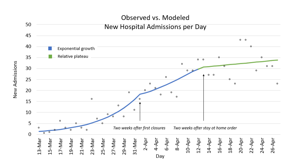
The point of the chart, the governor claimed, was to illustrate discontinuities on April 1, “Two weeks after first closures,” and April 13, “Two weeks after stay at home order,” thereby proving that those actions were effective in reducing hospitalizations that, she said, lagged infections by roughly the two-week incubation period after infection by COVID-19.
The dots are raw data, but my suspicions were immediately raised by the lines purporting to show an average trend through the dots. Assuming the raw data points are accurate, and it should be acknowledged that RI has been a leader among the states in quality and transparency of health data, what was the process used to draw those lines?

It turns out there is no single correct mathematical way to draw lines summarizing data points on a chart, but all of the usual ways result in either a smooth curve end-to-end or straight segments equally spaced along the horizontal axis. Engineering tends to use spline curves, computer graphics tends to use Bézier curves, and naive statistics tends to use piecewise moving averages. Without giving a long mathematics lecture, none of the usual methods of drawing curves could produce what the governor displayed.
So how did those sharp discontinuities get there on April 1 and April 13?
The only way to get that graph is to decide in advance to draw three smooth segments, with the result that the two visual discontinuities are essentially an artistic choice rather than a mathematical one. That’s not necessarily inappropriate, especially if the goal is to illustrate a conclusion reached by other means, but it would beg the question to suggest the opposite that the curve is evidence in support of the interpretation. Put more simply, the governor may be correct in her claim that her actions worked to reduce hospital admissions, but no fair using this chart to support that claim.
We asked the RI Department of Health for clarification, and they confirmed our suspicion: “The resulting three curves are from estimating discontinuities in the points and fitting regression lines to those discontinuities.” In other words, they estimated discontinuities first and then drew the lines on the chart to reflect their estimates.
We emphasize that we’re not accusing the governor of being intentionally deceptive. We’re not even accusing her of being wrong. But anyone looking at that chart is likely to be misled, we think, to interpret it as evidence in support of her claim rather than as an illustration of one possible way among many of looking at the data.
More Posts by The Author:
Heavy Rain, High Winds, Flooding Wed–Thu: Advisory for wind, watches for inland and coastal flooding posted
River Flood Warnings in RI, MA, CT: Wed through Fri, streets may be impassable at times
Snow possible but unlikely Sat mid-day: Little accumulation likely
Snow Thu Night: One inch expected
Significant Snow Storm Tue 5am – 3pm: Likely 6in but remote possibility up to 18in
