
The following article is derived from an interview with Lyric Sullivan, a PVD resident currently majoring in art history at MassArt who has a deep interest in what symbols and iconography mean within an historical context.
In the 1970s, at the request of Harvey Milk, artist, activist, and organizer Gilbert Baker was asked to create a symbol of hope to unite the queer community. Milk wanted Baker to create an image that moved away from the symbol of the day — a pink triangle, originally used to identify gay men in Nazi Germany and later reclaimed by the queer community as an emblem of remembrance. Milk wasn’t explicit in his request. We need a flag, wasn’t the sentiment, more like, We need to move on and establish a new visual language. Baker was further encouraged by his friend Arthur Bressan, a pioneer in independent queer cinema, to design a symbol for “the dawn of a new gay consciousness and freedom.”
1976 was the year of the American Bicentennial. Patriotic celebrations took place throughout the country, and American flags were popping up everywhere — pop art, fine art, TV commercials, T-shirts, souvenirs, and so on. It was a grand ‘ol time for American kitsch. According to Lyric Sullivan, “[The American flag] functioned as a message, and Baker identified the importance of a flag — not only as an internal identification symbol, but as a product. What it means to have a product distributed and what it means to have a product bought and valued.” Two years after the Bicentennial, Baker’s symbol was revealed: the rainbow flag.
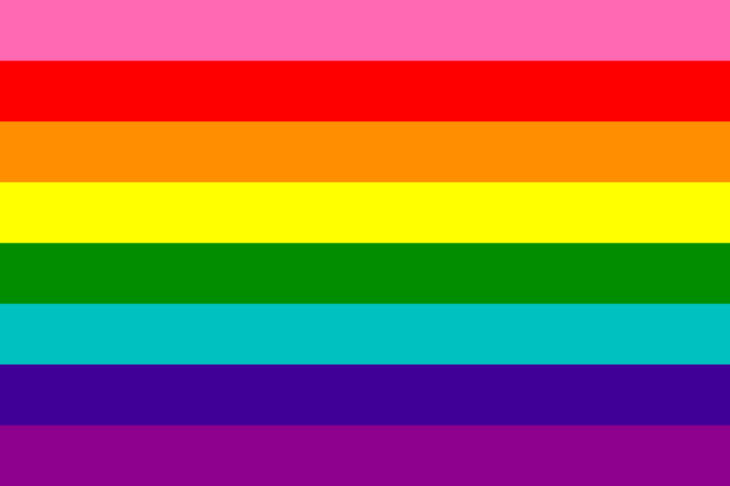
“In the original version of the Pride flag there were eight colors — pink, red, orange, yellow, green, turquoise, blue, and violet,” says Sullivan. “They acted as these sort of community virtues of the time. Pink was representative of sex; red, life; orange, healing; yellow, sunlight; green, nature; turquoise, magic; blue, harmony; and violet, spirit.”
In Baker’s autobiography, “He writes really passionately and eloquently about creating this symbol at an intense point of revolution, at this anarchist point in queer history,” says Sullivan. “It was commissioned at this significant point in time where there’s this national conversation regarding queer rights, and there’s this desire for a unification symbol, for something that can be widely distributed.”
By 1979, the flag was reduced to six colors. The pink and turquoise stripes were removed due to fabric shortages, but the rainbow symbol persisted. Since then, additional flags have been created to uplift LGBTQ+ communities. In 1999, activist and author Monica Helms created the transgender flag, featuring five horizontal stripes of three colors — light blue, light pink, white, light pink, and light blue. That same year, graphic designer Sean Campbell created the labrys lesbian flag, featuring a double-headed ax centered in a black triangle set against a violet background. In subsequent years, both the transgender and lesbian flags were reimagined to increase inclusivity, distance themselves from negative appropriations, and uplift underrepresented communities, but Baker’s six-colored rainbow flag remained largely unaltered until recently.
In 2018, American artist and designer Daniel Quasar unveiled the “new” Pride flag known as the progress flag. Based on Baker’s original 1978 design, the progress flag inserts a chevron pattern of five colors — the three colors of the transgender flag, plus black and brown stripes to represent people of color and those living with, affected by, or lost to AIDS — along the hoist of the rainbow flag. The progress flag has already undergone its first major alteration, and is now commonly shown with a yellow triangle and a purple circle to represent intersex communities.
“What initially was striking about it to me is how insignificant or empty the gesture feels,” says Sullivan. “I like the intentionality of producing the new flag, that it’s supposed to be this new unification symbol that uplifts or brings attention to marginalized members of the community, but what is happening internally?
Baker had this status as an activist and an organizer, and had really been a participant in the community at large. He had a good idea of what his community needed, of what they needed to address, and what their values were. I don’t know anything about the background of the progress flag artist. Maybe they’re in a similar position? But I can’t even think of their name off the top of my head. I’m not sure what their contributions are besides the production of this new symbol.”
Sullivan goes on to explain, “The flag doesn’t create the meaning, it’s what the collective consciousness imposes upon the flag.” They speak about the recognizability of the original Pride flag and the feeling of safety it elicits. “This would be true of any queer person — if you’re in a city that you don’t know very well and you’re walking around and you see a business that has a Pride flag, you’re going in there to ask for directions.” They share their thoughts on the design. “I mean Jesus Christ, a chevron pattern over horizontal stripes? It’s fucking hideous, it’s a bad design. It’s not functional and not thoughtful.”
But above all, Sullivan underscores the dangers of empty gestures, and how attempts to be inclusive can exacerbate exclusivity. “When you take a universal symbol and try to make it specific in the pursuit of gaining something, there’s actually a lot that gets lost. The progress symbol uplifts and names marginalized groups within the queer community and in the same breath it unnames many others.
“The reproduction of [the progress flag] articulates this general message or virtue, but it doesn’t seem like there’s much happening internally or on a ground level to address the issue [of inclusivity] that the image is claiming to have addressed.
“I’m of the opinion that disabled queer people are probably the most underrepresented and excluded groups within the community. So much of the experience of gender and sexuality, for a lot of queer people, starts at the body. Physically disabled people often have experiences that can be left out of those conversations… So set groups are now represented on this universal image, but what about the groups that are not represented?”
Sullivan is left asking questions: Where does this end? How many times will a new symbol be incorporated? Who do we consider underrepresented and who decides? What is our standard for what inclusion looks like? How do we understand ourselves as individuals within a larger community? How do we understand our identity and solidarity with each other? How do we reconcile?
“I think there’s this endless conversation between how we move forward and imagine these new futures, while also addressing our past and living within the boundaries of our present… What I would be really interested to see is the rainbow flag that incorporates these new colors and has new virtues assigned to them. But I don’t know, if I were assigned to recreate a flag for the entire queer community, I’d probably just draw a flower on a blue background.”